Maps, Graphs, and Figures
Covid-19 Event Risk Assessment Planning Tool – Researchers at Georgia Tech launched an interactive site so that users can visualize and assess the risk that people with Covid-19 will be present at a wedding, party or other event they are planning to attend.
COVID-19 Projections – Institute for Health Metrics and Evaluation
Key Metrics for COVID Suppression – Harvard Global Health Institute
US Covid Atlas – The University of Chicago
How We Reopen Safely – Tracking states as they make progress towards a new normal
CovidActNow – See COVID data and risk level for your community. All 50 states. 2,100+ counties.
How Severe Are Coronavirus Outbreaks Across the U.S.? Look Up Any Metro Area – The New York Times
Five Ways to Follow the Coronavirus Outbreak for Any Metro Area in the U.S. – The New York Times
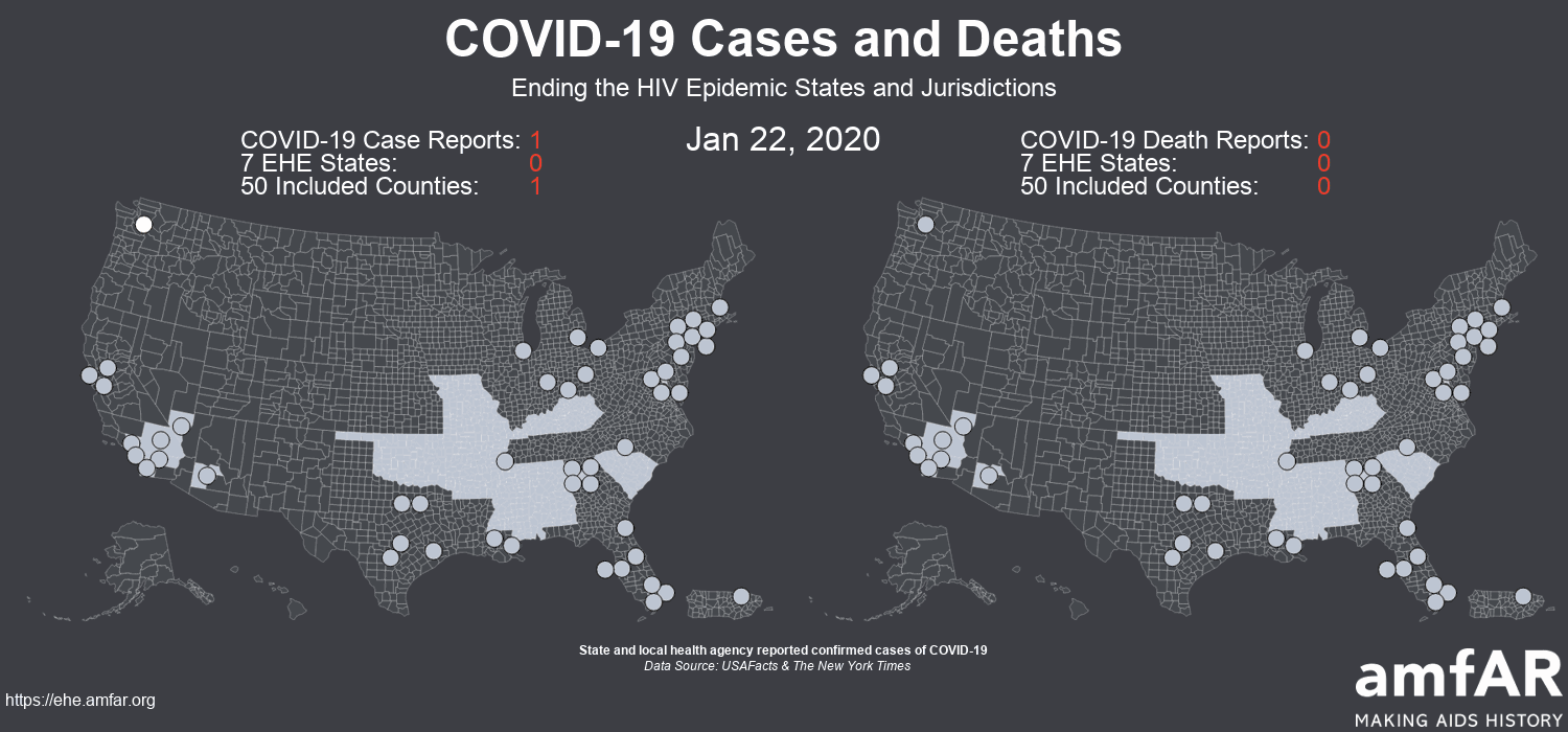
COVID-19 Cases and Deaths in Ending the HIV Epidemic States and Jurisdictions – amfAR, animated national maps of COVID cases and deaths from January through now.
COVID-19 Cases and Deaths – amfAR, animated national maps of COVID cases and deaths from January through now.
COVID-19 United States Cases by County – Johns Hopkins University
Global COVID-19 Map – Coronavirus COVID-19 Global Cases by the Center for Systems Science and Engineering (CSSE) at Johns Hopkins University (JHU)
US Coronavirus Map – USA Today – sourced from Johns Hopkins University, WHO, and CDC and regularly updated
How Much Worse the Coronavirus Could Get, in Charts – New York Times
Live tracker: How many coronavirus cases have been reported in each U.S. state? – Using data from the COVID Tracking Project, we’re following how each state is responding to COVID-19.
Projected hospital resource use based on COVID-19 deaths – These charts show projected hospital resource use based on COVID-19 deaths. The model assumes continued social distancing until the end of May 2020.
The COVID Tracking Project – Collects and publishes the most complete testing data available for US states and territories.
US Health Weather Map – This map shows you how much influenza-like illness above the normal expected levels detected since March 1.
CovidActNow – Projections show when hospitals will likely become overloaded, and what you can do to stop COVID.
Does My County Have an Epidemic? Estimates Show Hidden Transmission – New York Times, number of cases and probability of community transmission by county.